Westend Brand - Refreshing Communication
Agency: Geometry
Client: Westend / Gránit Pólus
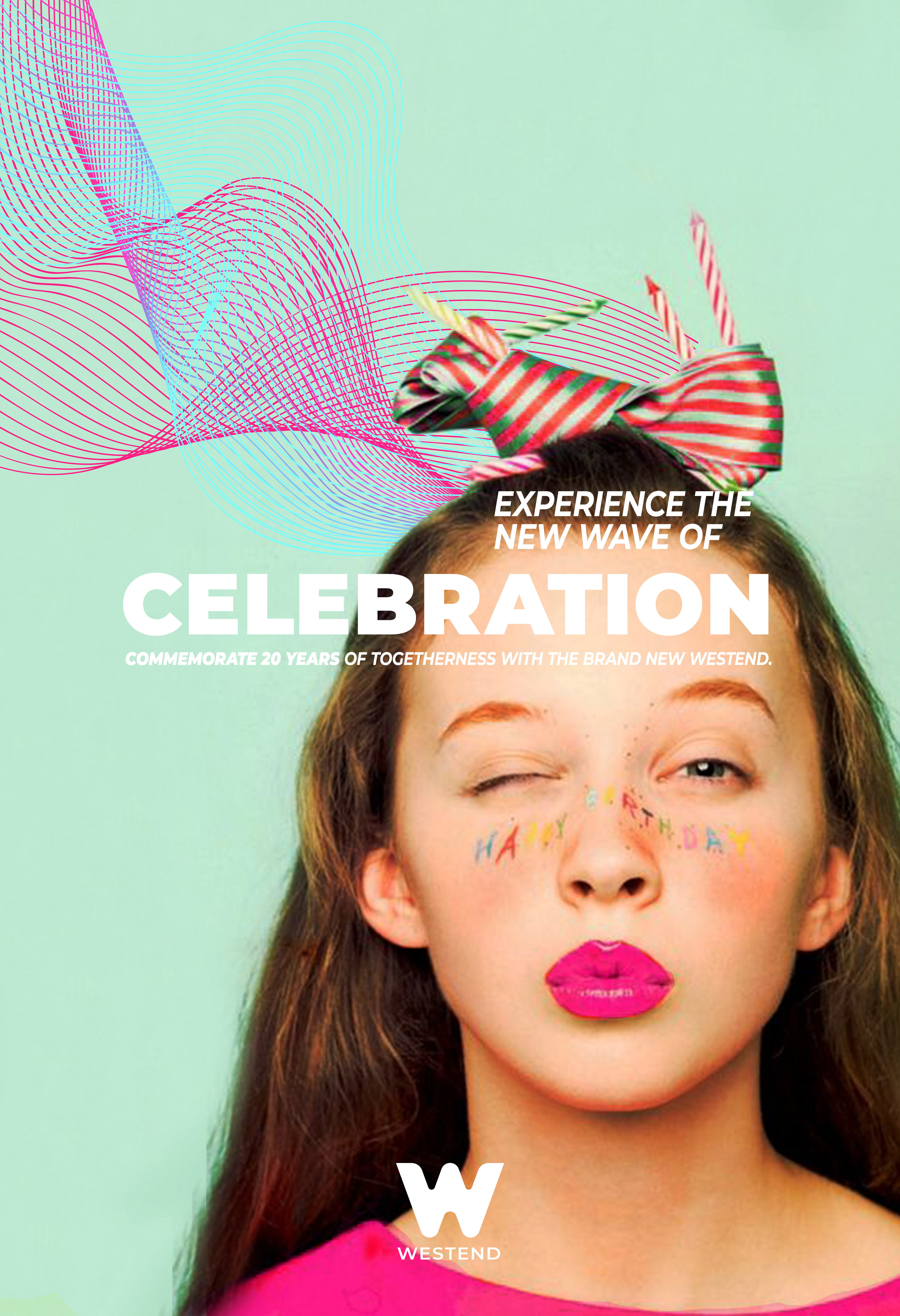
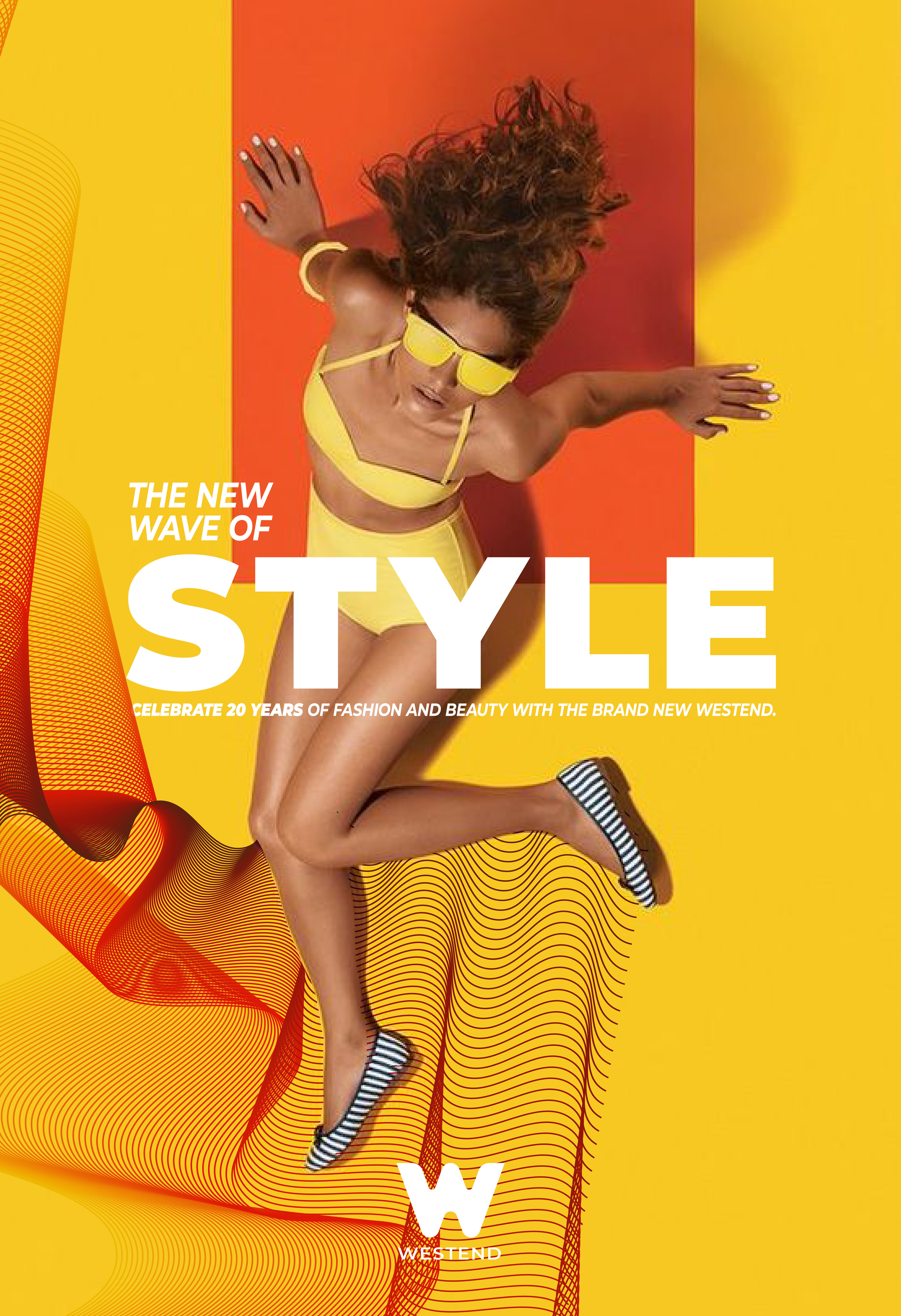
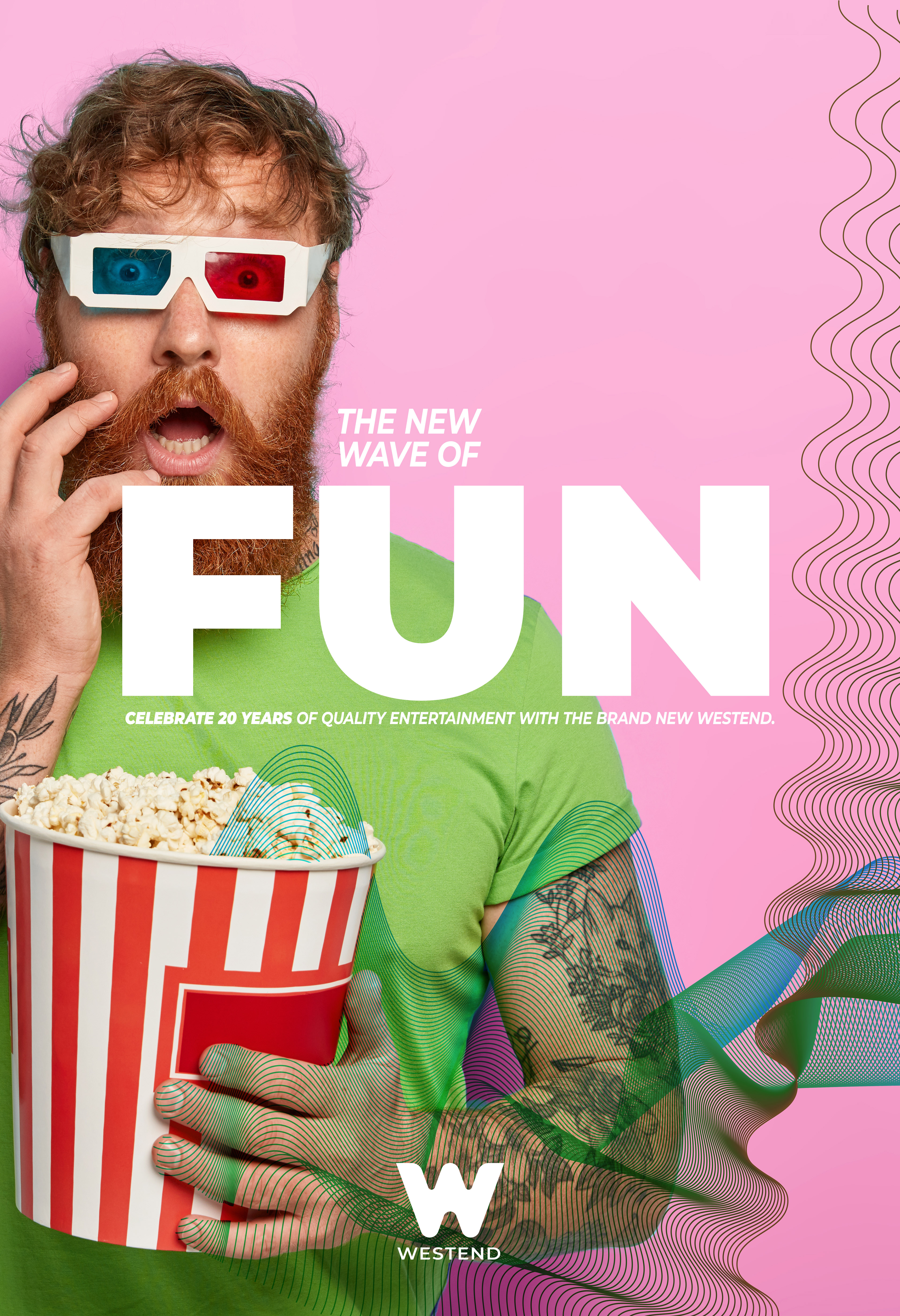
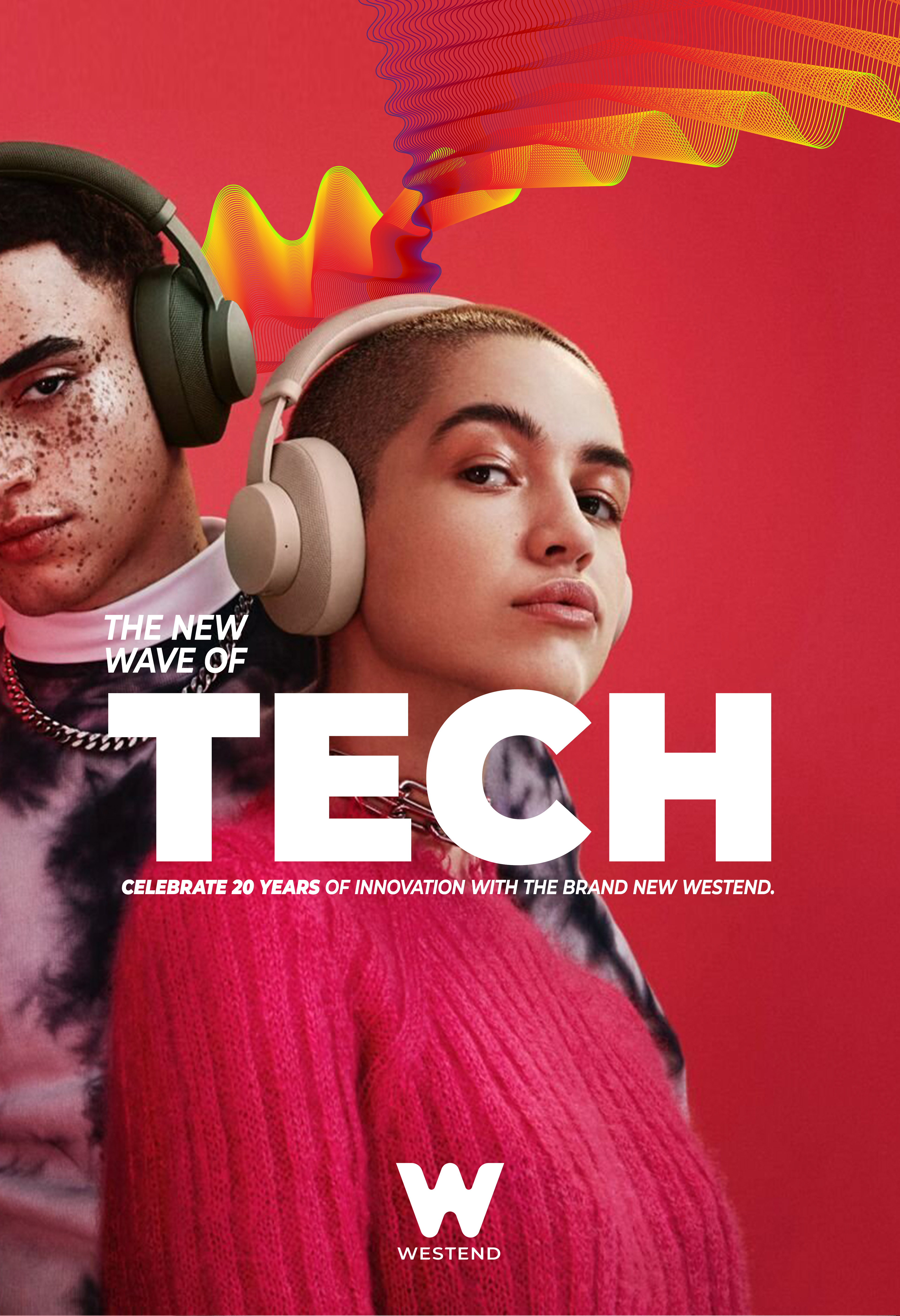
The new Westend Shopping Centre is about progress. Keeping track of the latest trends, staying ahead of the competition, attracting people with innovative and personalised shopping experience makes this shopping centre one of the best of its kind. The new look and feel of the brand uses a dynamic wave symbol that encapsulates this never-ending progress. Making waves, moving forward in style, technology and entertainment are benchmarks of the new identity. This is the reason why we have created a line of communication that makes Westend unique and desirable again; a hub that puts community in the centre, a place where people hang out, where they gain new experiences, and they become the wave of the progress themselves.
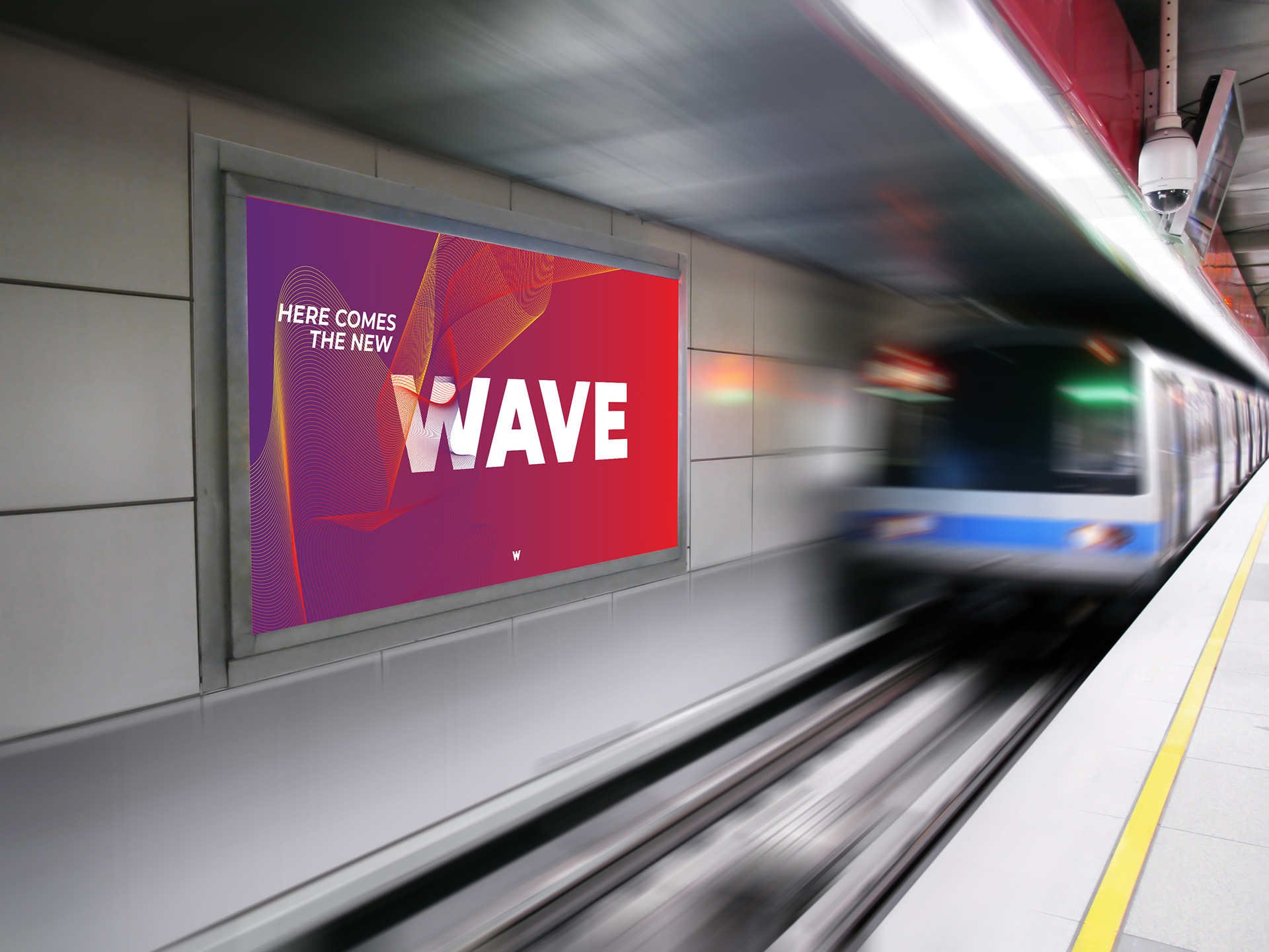
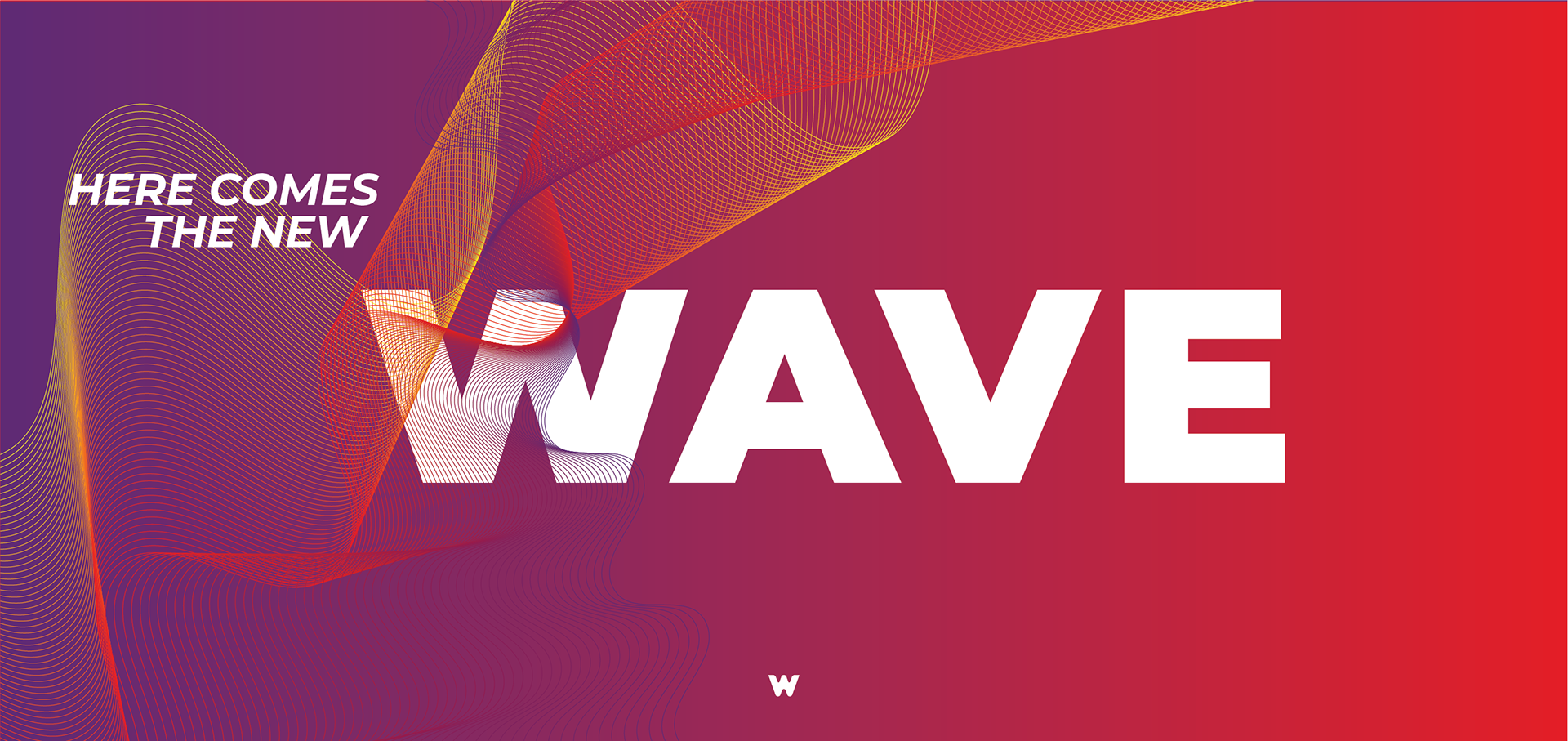
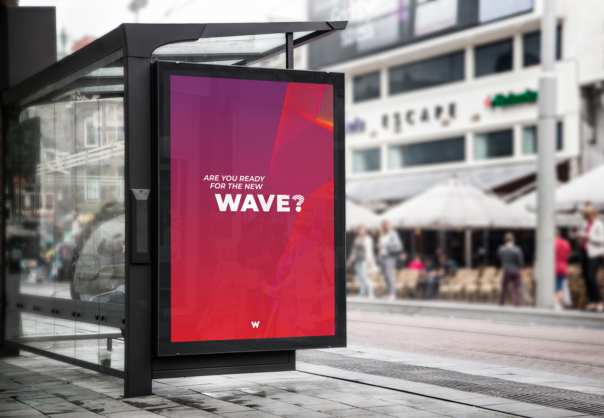
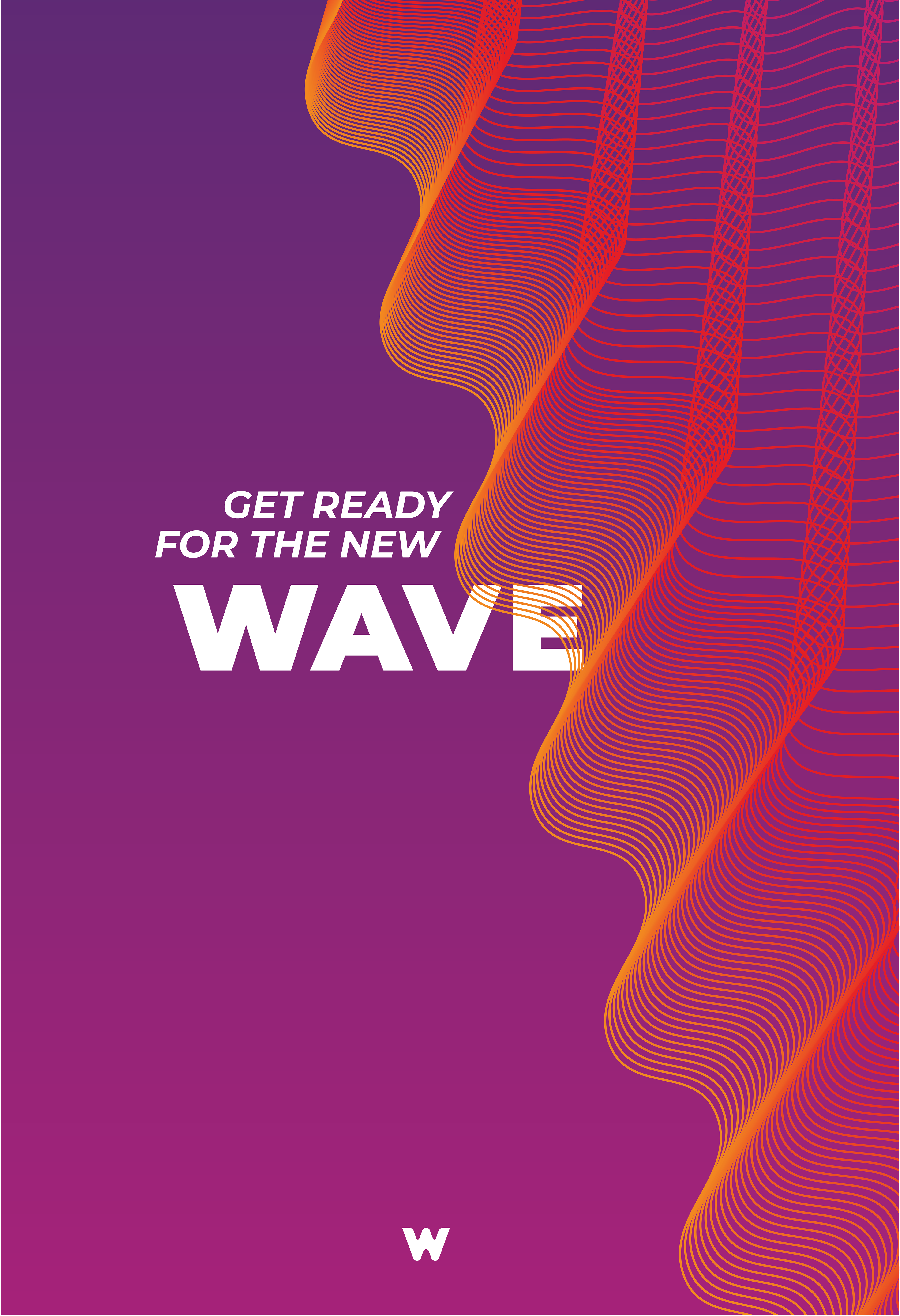
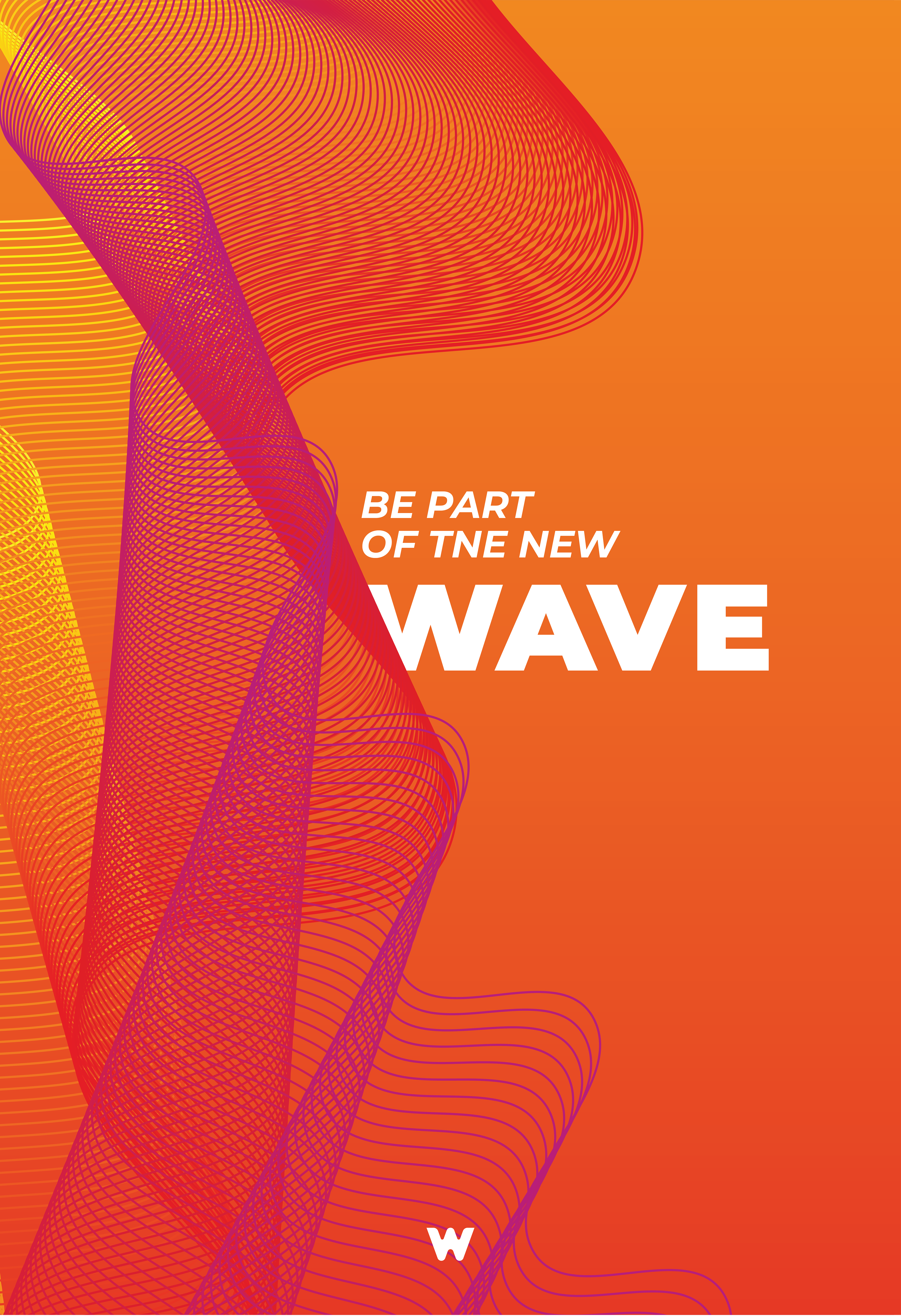
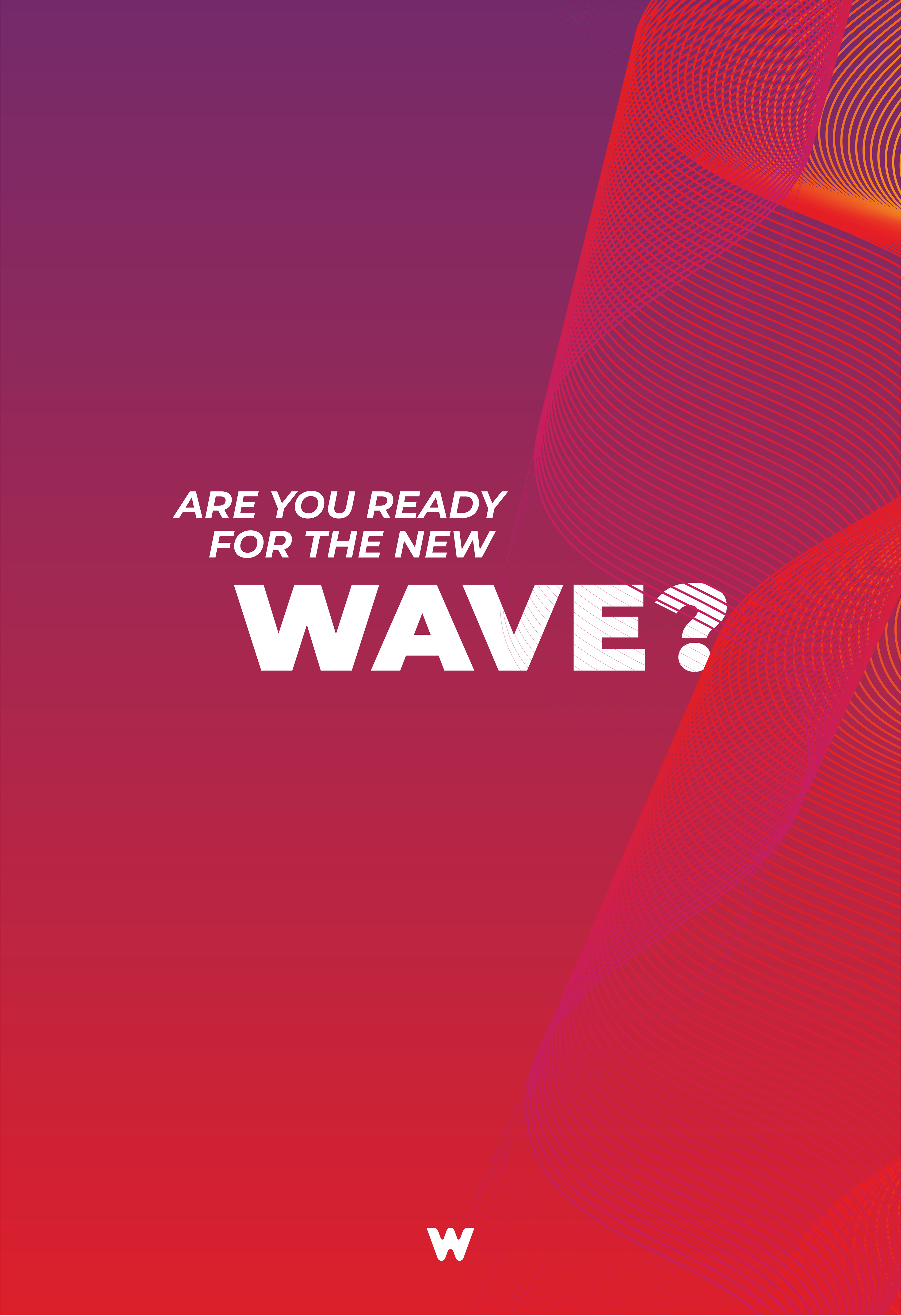
The core of the concept lies in the wave motif that encompasses the progressive communal thinking that the new Westend represents. This dynamic symbol connects our communication materials from interior décor through online to offline channels, always ending in the iconic “W”. The new logo of the shopping centre can be filled with photographic imagery. All materials are divided into categories matching the new brand pillars: Style, Entertainment and Community are connected by innovative technology as an amplifier. Each pillar is given a brand colour, so as people become more familiar with the meaning of each colour, they can instantly identify with the categories that each piece of communication reflects; all connected by the distinctive wave motif.
